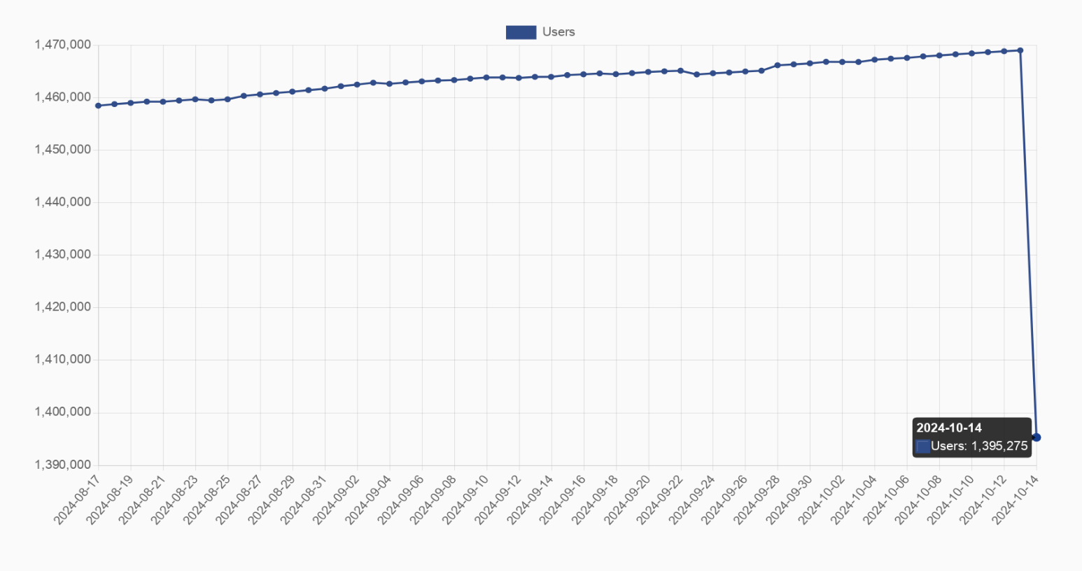
Blaze@feddit.org to Fediverse@lemmy.worldEnglish · edit-223 hours agoAlright guys, who shut down their farmbot yesterday? Loss of 70k users (5%), graph might be misleading feddit.orgimagemessage-square41fedilinkarrow-up1238arrow-down112file-text
arrow-up1226arrow-down1imageAlright guys, who shut down their farmbot yesterday? Loss of 70k users (5%), graph might be misleading feddit.orgBlaze@feddit.org to Fediverse@lemmy.worldEnglish · edit-223 hours agomessage-square41fedilinkfile-text
minus-squareDave@lemmy.nzlinkfedilinkEnglisharrow-up125arrow-down6·1 day agoThat graph is so misleading. Makes it look like almost all the users disappeared but the Y axis only covers a small range at the top.
minus-squareJumuta@sh.itjust.workslinkfedilinkEnglisharrow-up6arrow-down1·8 hours agono it’s not? you can see the axes and op even mentions that it’s a 5% drop the graph is clearly just fitted to the data
minus-squareBlaze@feddit.orgOPlinkfedilinkEnglisharrow-up8·8 hours agoI edited the title after their comment, it wasn’t that clear at the beginning
minus-squareDave@lemmy.nzlinkfedilinkEnglisharrow-up24arrow-down1·1 day agoExactly. Not the over a million that it looks like at a glance. The user count isn’t helpful anyway, active users is a much better measure.
minus-squareBlaze@feddit.orgOPlinkfedilinkEnglisharrow-up12arrow-down1·1 day agoI captured the graph with the number after the decrease at the bottom right to try to show the number of lost users, but I see where you come from
minus-squarebeefbot@lemmy.blahaj.zonelinkfedilinkEnglisharrow-up1arrow-down12·1 day agoIf you saw why people would criticise it then you’d… edit the post, recapture the graph with an accurate visual representation including the zero on the Y axis?
minus-squareBlaze@feddit.orgOPlinkfedilinkEnglisharrow-up18arrow-down1·23 hours agoWell… that’s how the website displayed the graph when I took that screenshot, I’m pretty sure you can’t modify the axis I’m not on my computer at the moment, editing is the most I can do right now if you can capture the graph with 0 on the Y axis, please post it below and I’ll update the picture
minus-squareGBU_28@lemm.eelinkfedilinkEnglisharrow-up7·22 hours agoOr just inform the other adults to consult the axis for clarification.
minus-squareSlothMama@lemmy.worldlinkfedilinkEnglisharrow-up7·24 hours agoIt’s the only way to demonstrate the fall, of you did it at scale it would’ve even be noticeable.
minus-squareMotoAsh@lemmy.worldlinkfedilinkEnglisharrow-up2arrow-down2·edit-223 hours ago5% is noticeable unless the graph is under 20 pixels tall. Even then, dithering or antialiasing techniques could make it visible.
minus-squarelambalicious@lemmy.sdf.orglinkfedilinkEnglisharrow-up9·1 day agoLies, damned lies and statistics.


That graph is so misleading. Makes it look like almost all the users disappeared but the Y axis only covers a small range at the top.
no it’s not?
you can see the axes and op even mentions that it’s a 5% drop
the graph is clearly just fitted to the data
I edited the title after their comment, it wasn’t that clear at the beginning
It’s like 70k users.
Exactly. Not the over a million that it looks like at a glance.
The user count isn’t helpful anyway, active users is a much better measure.
true that
I captured the graph with the number after the decrease at the bottom right to try to show the number of lost users, but I see where you come from
If you saw why people would criticise it then you’d… edit the post, recapture the graph with an accurate visual representation including the zero on the Y axis?
Well…
Or just inform the other adults to consult the axis for clarification.
It’s the only way to demonstrate the fall, of you did it at scale it would’ve even be noticeable.
5% is noticeable unless the graph is under 20 pixels tall. Even then, dithering or antialiasing techniques could make it visible.
Lies, damned lies and statistics.