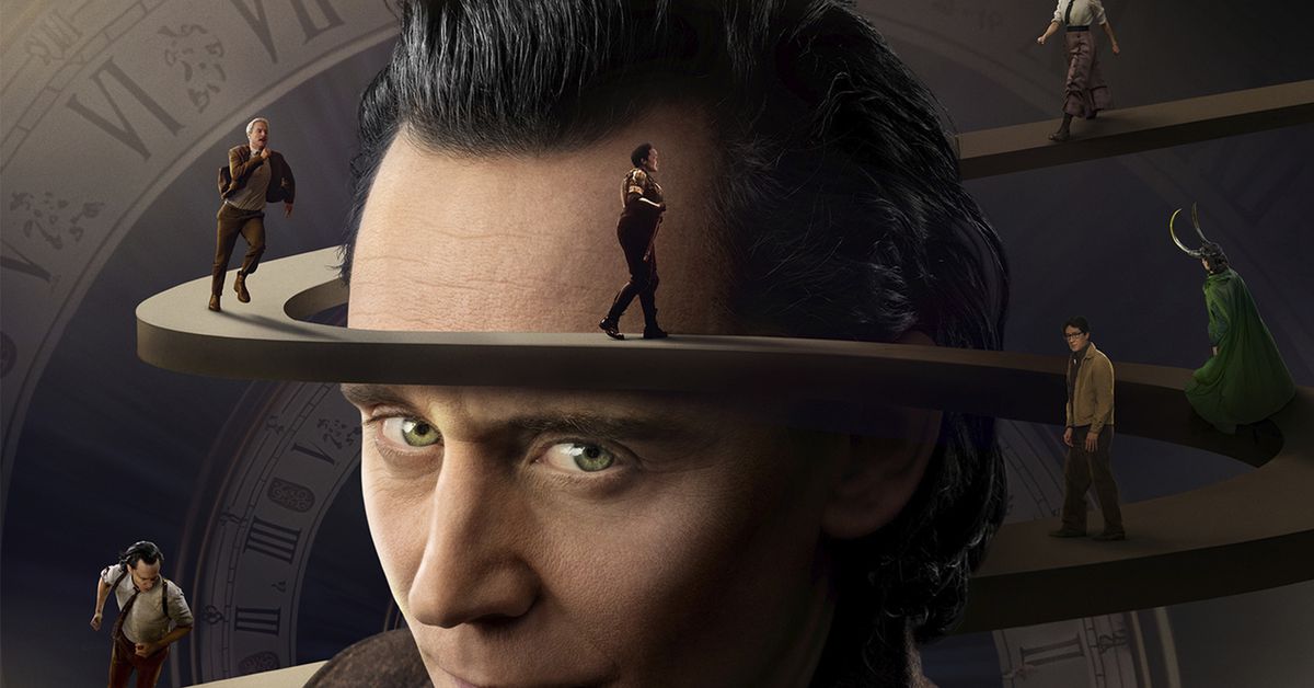
Disney’s Loki faces backlash over reported use of generative AI / A Loki season 2 poster has been linked to a stock image on Shutterstock that seemingly breaks the platform’s licensing rules regard…::A promotional poster for the second season of Loki on Disney Plus has sparked controversy amongst professional designers following claims that it was created using generative AI.


This article is so dumb that their entire basis for the artwork to be an AI artwork rests on the fact that there are squiggly lines. Like humans have never edited any photo with squiggly lines.
The image uploaded to Shutterstock was 2500 x 2500. Does any AI image generator even produce those resolutions? Sure, you can use super resolution, but that seems like too much work for AI generated artwork.
Also there were Twitter users pointing out how “4” on the clock is represented as “IIII” and not “IV”. Have they ever not seen clocks with Roman numerals?
IV is the Roman numeral. IIII is like hatch marks or something, you don’t usually see that on a clock.
Do an image search. IIII is often used on clock faces because visual symmetry.
Wow I’d never seen that before. Also just curious on the reasoning, why would they use IIII for symmetry but not do anything about VI, VII and so on? Is it more to do with the width of the number when written down maybe?
I was taught that dividing the numbers naturally into thirds:
I  II III IIII (all I)
V  VI VII VIII (all start with V)
IX X  XI  XII  (all contain X)
Visually looks more “balanced” than having an extra V
VI would be IIIIII which is severely over-wide. The balance is really against VIII and XII, you don’t want one leg of that triangle to have a limp and IIII makes IV just a bid wider and chunkier to provide that balance. “Symmetry” was probably a poor choice of word this isn’t a mathematical thing but perceptual, those three points being equal visual weight evoke an equilateral triangle standing on its side which says “yep this won’t tip over, ever”, because, well, things shaped such don’t and the back of our head instinctively knows. Thus you get a sense of stability, and I guess this is a good example of why artists often sound like mystics or plain nuts (“this song tastes of strawberries”).
The IVPPITER explanation definitely also makes sense but it doesn’t explain why people continued to do it after standardisation on IV in arithmetic and the fall of Roman paganism.
https://newgateworld.com/blogs/style/should-it-be-iiii-or-iv-on-a-clock-dial#:~:text=When Roman numerals were in,so IIII was introduced instead
I would have thought it had to do with aesthetics. I would have never guess it had to do with roman religion.
That’s really cool info
YOU don’t see that on a clock. Your experience isn’t universal. IIII was often used for 4. There were no reduction rules when Roman numerals were in use. The idea of IV being THE way to write 4 is a reflection of modern education.
Also, the idea the human clocks have IV whereas a computer trained on human images might write it as IIII when no training images are like that is weird.
I’ve already conceded, jeez.
Just ranting at the void. The fact that it hit a topic related the one I replied to is purely coincidental.
Come to think of it, it’s pretty vain of you to think just because I started a post replying to your post with a big capital ‘YOU’ that I was talking about you. Get over yourself.
I kid, it was nothing personal.
I just wanted to point out that this is an example of anomaly hunting where one spots something is off and tries to work out how it is evidence of something. in a lot of cases, the anomaly is not in fact anomalous. In other cases, it is an anomaly, but doesn’t lead to the conclusion jumped to. This was both.
IV is used exclusively as 4 (except for clocks as someone else already commented) since the 15th century. Ancient Romans used both writing, IIII and IV.
Interesting, are there instances of other numerals having variants or was 4 a unique situation?
Well played.
I thought the exact thing when I typed it haha
Removed by mod