You must log in or register to comment.
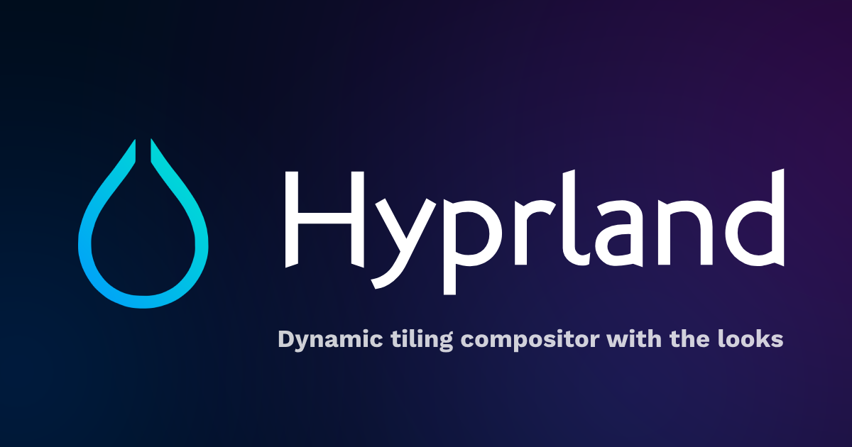
why does the logo look like a noose
The subtle ways having a toxic community affects unconscious design decisions. It’s a message.
…joking, to be clear. Could be a raindrop.
https://en.wikipedia.org/wiki/Rorschach_test
You doing OK?
I’m very happy and healthy but thanks for asking
I always thought it looked like a stylized water drop. Or a minimalist flame.
why does the logo look like a noose
Logo looks like if Apple redesigned the Millennium Falcon.
Is there something significant about this release, or are we just going to have a post every time every piece of software releases a new version?
I’m working on a script that runs
yayevery hour, gets the list of upgradable packages, and creates a post about each one of them


