- cross-posted to:
- technology@lemmy.world
- cross-posted to:
- technology@lemmy.world
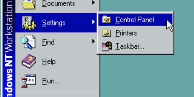
Last week, Microsoft mentioned in a support document that it was formally deprecating Windows’ 39-year-old Control Panel applets. But following widespread reporting of the change, Microsoft has either backtracked or clarified its language to remove the note about Control Panel being deprecated in favor of the Settings app. Here’s what the original post said, as also preserved by the Internet Wayback Machine (emphasis ours):
“The Control Panel is a feature that’s been part of Windows for a long time. It provides a centralized location to view and manipulate system settings and controls,” the support page explains. “Through a series of applets, you can adjust various options ranging from system time and date to hardware settings, network configurations, and more. The Control Panel is in the process of being deprecated in favor of the Settings app, which offers a more modern and streamlined experience.”
The current version of the page has changed that last sentence considerably. It now says that “many of the settings in Control Panel are in the process of being migrated to the Settings app, which offers a more modern and streamlined experience.”
It’s not clear whether this reflects a policy change or just a clarification of language. We’ve asked Microsoft whether it has changed plans to deprecate the Control Pane or if the original version of the support page was just incorrect in the first place, and we’ll update if we receive a response.
the Settings app, which offers a more modern and streamlined experience.
tl: “modern” means “less usable UI” and “streamlined” means “less functionality”
No no, “modern” means “includes blank space specifically for us to stick ads on”.
Less functionality as in “unable to open more than one panel at a time”
I stg Windows, every new UI is aggravating half-baked drivel.
(obligatory remark about the fact I mostly use Linux here)
I’d classify that as under “less usable UI”. There’s two different concepts in interface design: utility (i.e. can it do what you need it to) and usability (i.e. how easy and effective to use is it).
With utility/“less functionality” I was thinking about people saying they have to still open Control Panel because the “new” Settings still can’t do everything Control Panel can do after what, 12 years?
It’s somewhat bizarre to me that the settings menu isn’t just a reskinned control panel that either launches the new or old items depending on what they’ve finished so far.
I can’t imagine what they’ve done is easier than rewriting control panel items in full one by one.
You can do a halfway decent job of modernizing just by having an “advanced” toggle that shows the more arcane/less used settings.
I understand the desire to race towards a minimum viable product and get the core functionality into the glossy new thing, but they already had a minimum viable product in the control panel.
Maybe. I use Settings for quick things like Bluetooth pairing, changing monitor settings, etc. I do use Control Panel a decent amount and would never want it deprecated though.
Then they would have to remove the various hooks in the Settings app that actually call and open the Control Panel.
How many are there? I can think of several (advanced mouse settings, advanced network settings, printer properties, date & time has a callout back to the old panel…)
Windows 10 came out nine years ago, so they don’t seem in any particular rush.
Lol. I think they claimed that Settings was going to replace Control Panel when Windows 8 came out. It’s been 12 years. 😂
It’s long overdue for MS to shit or get off the pot. Either allocate some resources to this pet project or give up the pretense that it is ever going to happen.
I don’t understand why the control panel UI wasn’t modernized instead? Would that really be unfeasible? I think it still might have been less work than to maintain 2 coexistent “settings/control panel” apps and migrate from one to another. Sometimes you have to throw out the old code base and start from scratch. But if you do so shouldn’t you rather distrubute the result when your finished and not in a half-baked compromise-like state?
I don’t understand why the control panel UI wasn’t modernized instead? Would that really be unfeasible? I think it still might have been less work than to maintain 2 coexistent “settings/control panel” apps and migrate from one to another. Sometimes you have to throw out the old code base and start from scratch. But if you do so shouldn’t you rather distrubute the result when your finished and not in a half-baked compromise-like state?
Sound is in there too. The one that annoys me is the printer settings being under “Bluetooth” instead of “printers”.
Who doesn’t connect their printer over Bluetooth?
I get why they did it ( because it’s “printers and other devices”) but seriously would it be that hard to link it in both places? Or actually make a printer settings that works worth a shit so you don’t need the control panel app?
The 3 most used settings for us at work are Displays, Bluetooth, and Printers. Honestly I just use search and type. Just used to that from mobile device settings and app searching.
The excellent built in audio compressor called Reduce Loud Noises is buried in the Enhancements audio Control Panel.
Someone found something that still depends on the control panel that will not be easily moved or done away with I bet.
More like, the devs already knew but some middle manager promised they would remove it without understanding the ramifications, and now they’ve been schooled.
This is totally the answer.
Maybe that’s why the dialer app is still there as well.
I’m dying to know what it is
“Streamlined”
What a fucking load of steaming bullshit. The Settings app is complete dogshit compared to Control Panel. If I want to click through 6 pages of nested settings pages for Networking, or 1 screen of all the settings in one place, I think I know which one I would call “streamlined”.
Jackasses.
Also it’s just broken. Try to add an IP without gateway and it won’t let you.
Funny thing is I remember control panel being criticized for having things too many dialogs deep. Now you have more clicks when using settings instead of less.
I don’t even use Windows anymore and I cringe at the thought of being forced to use the Settings app over Control Panel.
As an occasional windows user I was trying to come up with a counter-example for you but I couldn’t think of one lol.
Edit: oh it’s cool that it supports night/dark mode!
I found it easier to search for settings that are supported by it. It tends to catch things even if the wording you use isn’t the exact name of the setting. The Windows search to bring up the control panel options from before they implemented the Settings app search has never really been reliable unless you recall what it’s actually called.
Agreed. The new settings window is a vast improvement over the classic control panel. It’s about the only place search is good in Windows and that’s probably why I prefer it when many don’t. 🤷🏼♂️
Knew it. They won’t dare invalidate the 35-year-old government PDFs instructing people on how to enable their firewall or whatever.
35 year old? The pdf could be released last week and most tasks would still require the control panel.
Hahaha.
“deprecated” doesn’t usually mean removed, just that new things shouldn’t use it because they may remove it at some unspecified time in the future. Some programming languages have had deprecated features for over a decade.
Right, deprecated means, stop using this API and move to the new hotness or whatever.
The updated language is what they’ve been saying since a couple years after Windows 10 came out. This story just went back to not being news lol
I mean it was hardly news to begin with.
I think this is likely to be what I saw others mention on earlier posts. Lots of enterprise or business software that hooks into the control panel.
So even if Microsoft does migrate all the Windows options over to settings there’s still going to be software that uses control panel to manage their own settings.
Unless Microsoft is going to make it possible to hook into the new settings app just as easily then they’re going to have to keep the old one around even though they keep crippling it.
They’re probably just going to disable it for manual access and add a regkey that you can add to regain access. (They’ve done the same for other ‘deprecated’ features)
Yeah it’s annoying as hell, wish they’d stop killing their own OS. I honestly think the first few builds of Windows 11 were a decent step in the right direction in terms of actually getting everything feeling relatively cohesive again. But the AI push and everything that happened right after release has started to let the rot creep back in again.
Next GPU I get I’m just going to run Linux as my main OS and have a VM with a GPU pass through so I can stop losing my mind.
I’ve been thinking about testing that myself. There’s a few things that are just a little more intuitive for me on Windows versus Linux, and for the handful of games that prefer Windows configuration or makes it easier to game on Windows might be handy to have a way to access Windows without it being my daily driver.
Then again, I have multiple computers and I already run Linux on my laptop which is the primary device that I use, I’m just talking about my game / audio workstation.
My entire PC gaming universe is Steam at this point. Not great form a lock in POV but it’s reality. What Steam runs on matters not.
For business I may as well be in Office 365 and Chrome world. Again, OS doesn’t matter at all.
The new settings page isn’t as good as control panel.
What was wrong with the Control Panel?
Not enough tracking, code is too old to add ads.
Font isn’t large enough. Not enough white space.
Oh god, I’m picturing ads for wireless routers in the network settings.
“The keyboard settings are brought to you by Logitech! Work. Play. Communicate.” *video ad plays with no ability to pause or change volume*
deleted by creator
Gives the user far too much control of their machine and you can accomplish a task far to easily.
That makes sense.
Haven’t many settings in the control panel been in the process of being migrated to the settings app for the last uh, 15 years?
I mean good for ya’ll at Microsoft, but
And it’s not even close to being finished
It really feels like it shouldn’t be THAT hard of a thing to do: I mean shit, we’re 4 major releases into this, and they somehow managed to put all the features in the original control panel in uh, one release.
you need to keep in mind that microsoft is a small business, so they don’t have a lot of resorces to assign to this
You need to keep in mind that Microsoft developers are only allowed to do what the marketing department wants to sell. Unglamorous fixes and improvements are left untouched for years or decades.
It will be driven my minimal viable product and running to a release at the end of every x sprints.
They don’t have the time or structure to build long term plans and well considered features.
Honestly I’m waiting for Settings AI now with CoPilot which changes your configuration based on what you’re doing, and only sometimes does stupid shit that you have to stop and sort out.
And then they’d have 3 control panel apps.
I really hope you didn’t open a Pandoras box saying that.
There’s a product manager in Redmond frantically scribbling this down for his next skiplevel meeting right now.
Well sure, but what about all the ad spots that wouldn’t have been added?
True, I was forgetting about the Shareholder Value™.
Which is silly of me, because it’s basically the only innovative thing Microsoft has done in the last oh, 20 years?
Pathetic leadership.
“Leadership”
Watch, you’ll have to sign up for a copilot service to access the control panel in the future.
Backtracks, for now
Yea, like Recall. It’s coming. They’ll just do it silently without any backlash because people will be talking about the new pile of shit Microsoft is doing and also arguing like “no, they cancelled that, here’s the link” to an article from 6 months ago.


